Stephanie embarked on her very own project last summer, a main floor renovation! Read along to hear about how Steph created her dream kitchen and an inviting home for her & her husband and their dog Fizz.
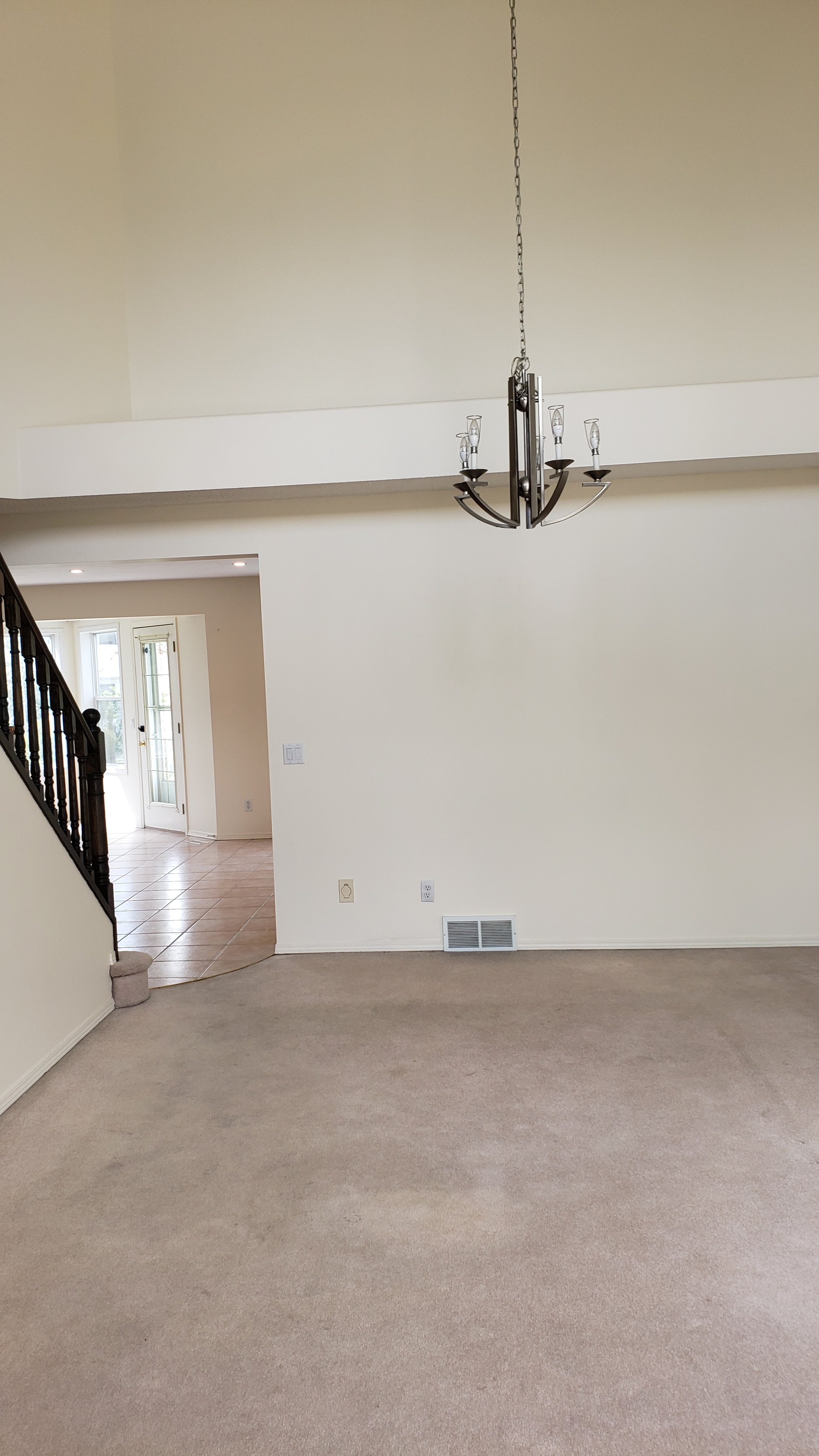
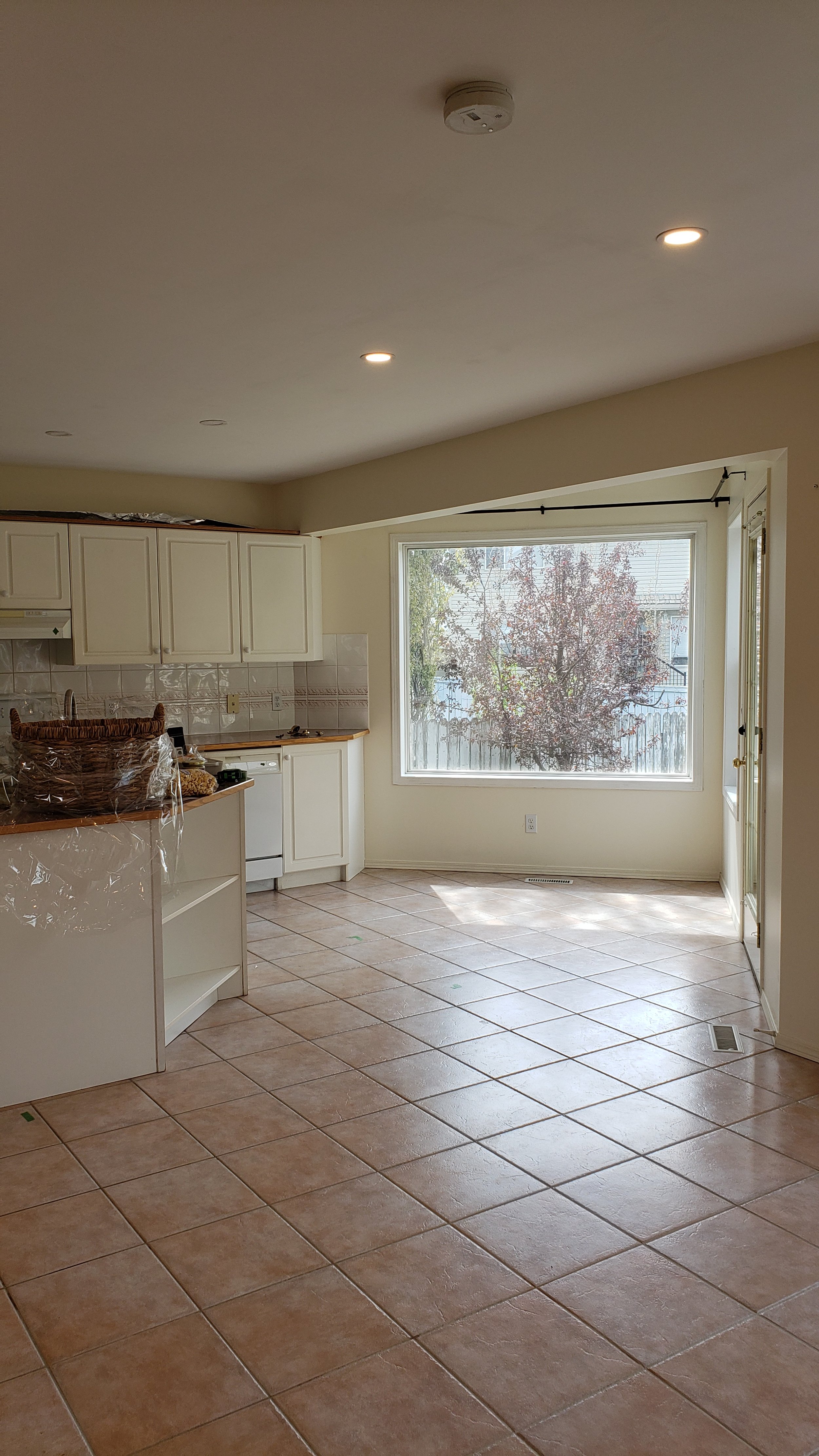
We purchased this home and immediately embarked upon a renovation to update the tired 90’s interior to a bright, airy space to reflect our personal relaxed style. The kitchen was the focus…and getting rid of that pink tile and carpet! The original kitchen had a corner pantry which I find is often wasted space, by removing the pantry, we were able to extend the cabinetry on the range wall and reorient the island to create more countertop surface and seating. The addition of the tall pantry cabinet works perfectly for organized food storage.
It has always been my dream to have a window seat, so when we toured the home, I knew immediately that the small kitchen nook would be the perfect spot for this! The angled windows and size of the nook didn’t lend well to a kitchen table, but by building in the bench and adding a small bistro table, it has become a perch for a quick meal, a lazy morning coffee or nap spot :)
Added bonus are the drawers below the bench which hold our overflow small appliances and serving dishes. Our new addition to the family, Fizz, even has his own drawer by the back door with balls and treats (and sunscreen for me!)
Connection among spaces is important, so by changing the living room to be off the kitchen, it has created a wonderful intimate living area on the back of the house, with the dining table now in the two storey front room for a more grand feel for entertaining.
Both my husband, Blake and I really enjoy cooking so a lot of thought was put into the function of the kitchen. One of the top priorities was getting a professional style gas range so we started with the appliance selections and I then began to lay out the kitchen based on those to create a nice flow and work space for both of us to be in the kitchen together.
Some of my favourite things about our new kitchen are the functional bits…from the two appliance garages beside the fridge which house our everyday small appliances and bread (haha, specifically bread, because my kitchen would not be complete without a fresh loaf) to the multiple pullouts (spice, oil, utensil, pantry pullouts and garbage/recycling center) These functional interior elements are not the star of the show visually, but I think are worth every penny as they make day to day use of the kitchen extremely functional and keeps things organized and clutter free.
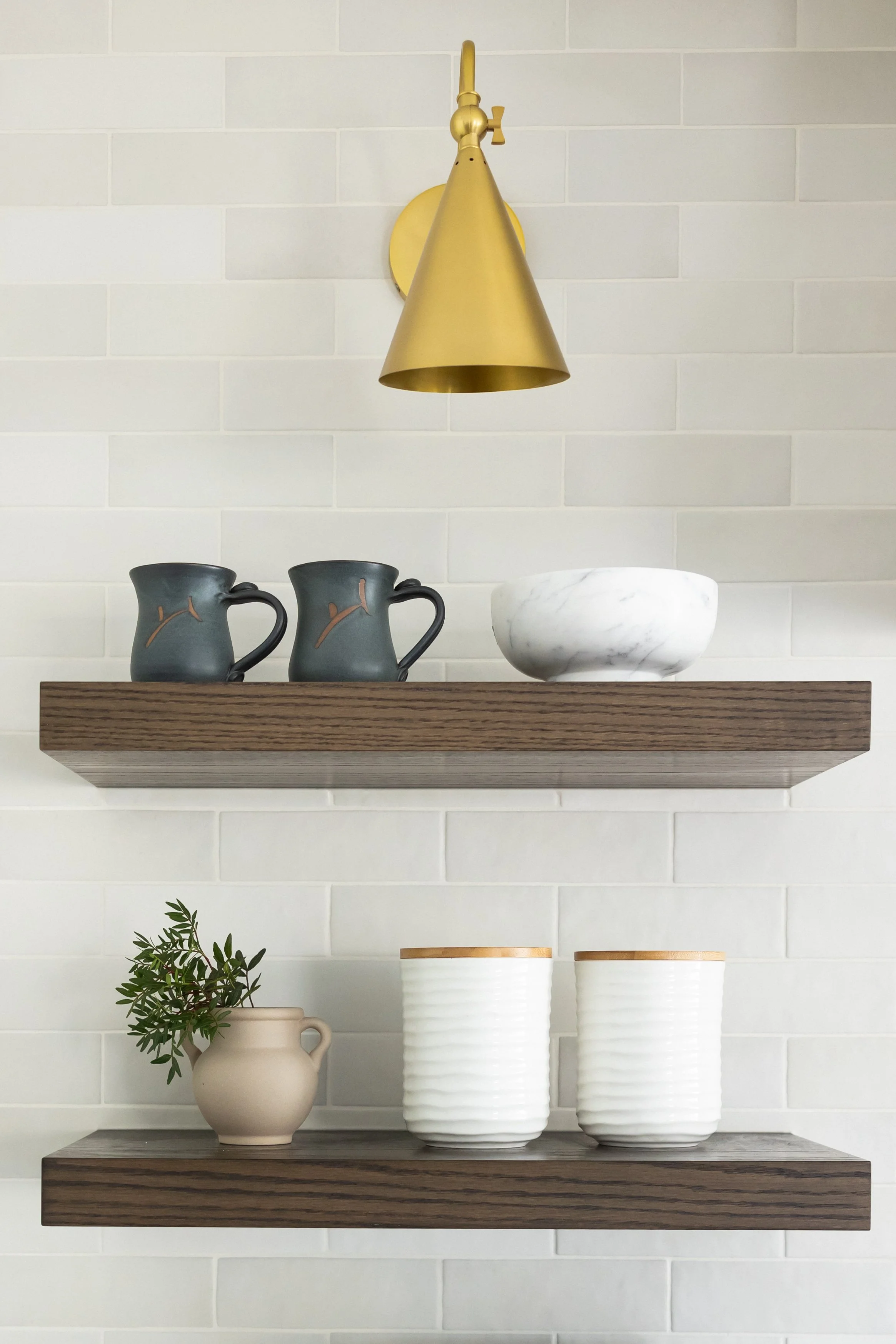
We are planning to be in the home for years to come, so it was really important to design a timeless kitchen, the details are what make it special with the 3 different door profiles (bevel shaker, round over with applied mullions on the pantry and v-groove on the bench), brushed gold hardware and custom hood. The cabinets are Benjamin Moore’s Titanium which is a soft grey that changes with the lighting and the shelves were a custom stain matched to the existing railing. It is one of the only original things left but I like to have a nod to the original home and have always had a soft spot for the vintage feel of turned railing. By far one of our favourite things has been the flooring which pulls everything together. Divine’s Chateau hardwood has beautiful variation and a natural look and feel which adds a very warm and inviting feel to our home!
Hardwood: Divine Flooring - Cosmopolitan Chateau
Custom Cabinetry: Evolve Kitchens
Backsplash: Centura Tile - Magma white
Counters: Cosentino - Ethereal Glow


